Portfolio Explorer


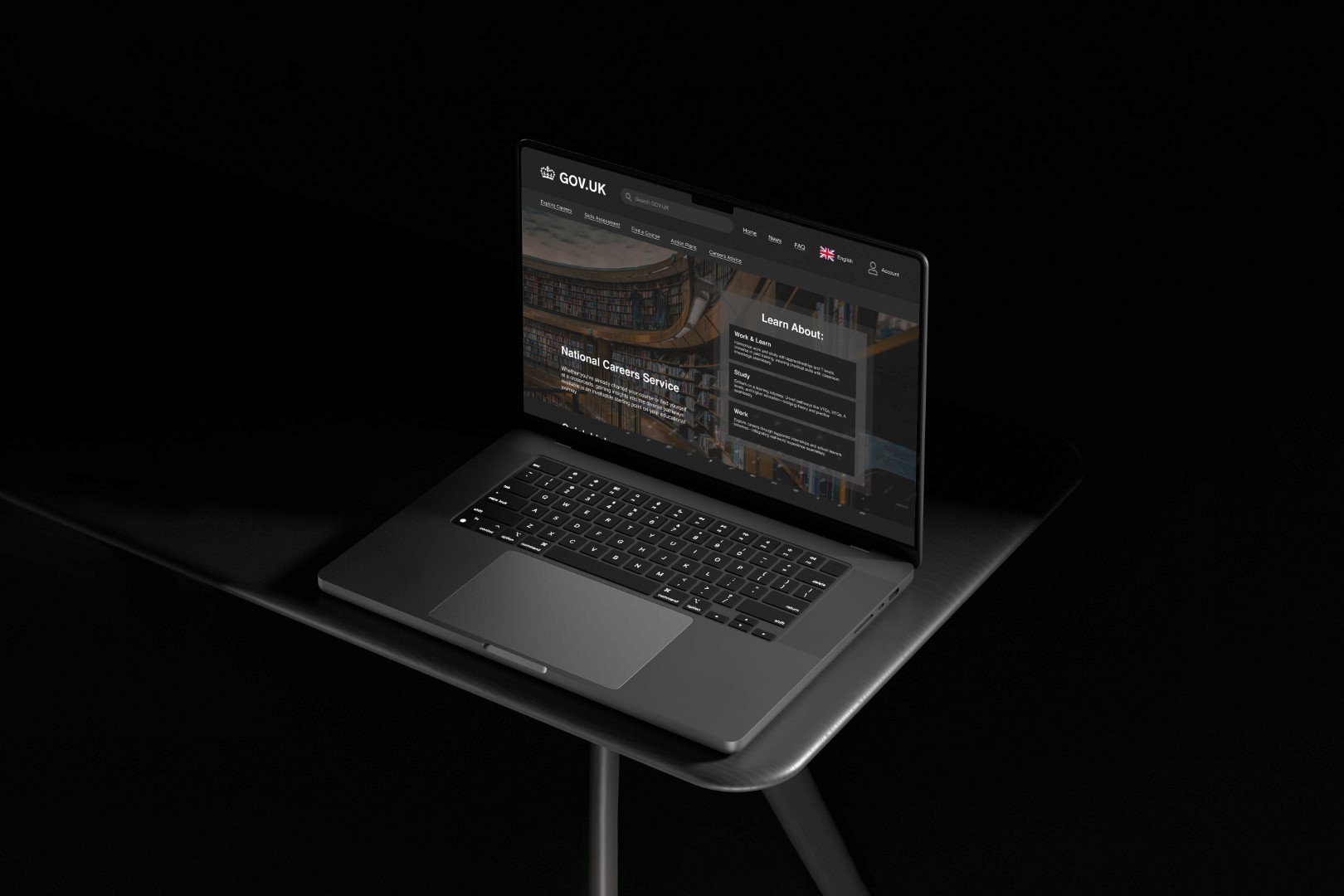
GOV.UK
In this project, my aim was to increase brand awareness for the Department For Education about the choices that young individuals can make after finishing school. What came out with this project was a website redesigned, focusing on consistent branding and colour schemes within the page and modernizing the website.
Client
GOV.UK
Year
2025
Services
Web Design
Figma
Industry
Government
The Problem
The Department for Education aimed to increase awareness of post-school choices for young individuals aged 14-17. However, the existing "Get The Jump" website suffered from poor engagement, an inconsistent design, and ineffective communication, making it difficult for students and parents to access and understand crucial information.
Key Issues
Uninspiring and Scattered Design – The website lacked a cohesive color scheme and structure, making navigation confusing.
Low-Quality Visuals – Poorly optimized images failed to create a strong and appealing user experience.
Limited Accessibility Features – The absence of features such as dark mode made the website less inclusive.
Weak Brand Recognition – The website did not align well with modern digital expectations, making the campaign less appealing to the younger demographic.
Low Trust in Government Websites – Research indicated that young users and their parents had little trust in government-led initiatives, impacting engagement.
Barriers to Engagement
The website's outdated design and lack of personalization led to low user engagement. Young users found the content uninspiring and difficult to relate to, while parents struggled to navigate the information effectively. Additionally, the lack of interactive features made the experience passive rather than engaging, further reducing interest and participation.

The Analysis
Understanding the core issues with the "Get The Jump" website required extensive research into user experience, government design systems, and engagement strategies for young audiences.
Research Findings
The website's outdated design and lack of personalization led to low user engagement. Young users found the content uninspiring and difficult to relate to, while parents struggled to navigate the information effectively. Additionally, the lack of interactive features made the experience passive rather than engaging, further reducing interest and participation.
Technical Limitations
The website's backend lacked scalability, making content updates slow and inefficient. Additionally, the rigid structure of the GOV.UK system restricted dynamic content implementation.

The Solution
By implementing a series of strategic changes, we successfully transformed the "Get The Jump" website into a more engaging, accessible, and informative platform for both students and parents.
Design & Accessibility Improvements
Modernized Layout – A structured, visually appealing design with a consistent color scheme for improved readability.
Higher Quality Visuals – Professionally optimized images that enhanced the website’s aesthetic appeal.
Accessibility Features – Introduction of dark mode for users sensitive to bright screens, increasing usability.
Engagement & Trust Building
Engaging Content & UI Enhancements – Simplified navigation and interactive elements that encouraged user engagement.
Alignment with GOV.UK Design System – Ensured compliance with government design principles while enhancing user-friendliness.
Building Trust – Clear and transparent messaging to address skepticism toward government-led initiatives.
Check out my other projects!


GOV.UK
In this project, my aim was to increase brand awareness for the Department For Education about the choices that young individuals can make after finishing school. What came out with this project was a website redesigned, focusing on consistent branding and colour schemes within the page and modernizing the website.
Client
GOV.UK
Year
2025
Services
Web Design
Figma
Industry
Government
The Problem
The Department for Education aimed to increase awareness of post-school choices for young individuals aged 14-17. However, the existing "Get The Jump" website suffered from poor engagement, an inconsistent design, and ineffective communication, making it difficult for students and parents to access and understand crucial information.
Key Issues
Uninspiring and Scattered Design – The website lacked a cohesive color scheme and structure, making navigation confusing.
Low-Quality Visuals – Poorly optimized images failed to create a strong and appealing user experience.
Limited Accessibility Features – The absence of features such as dark mode made the website less inclusive.
Weak Brand Recognition – The website did not align well with modern digital expectations, making the campaign less appealing to the younger demographic.
Low Trust in Government Websites – Research indicated that young users and their parents had little trust in government-led initiatives, impacting engagement.
Barriers to Engagement
The website's outdated design and lack of personalization led to low user engagement. Young users found the content uninspiring and difficult to relate to, while parents struggled to navigate the information effectively. Additionally, the lack of interactive features made the experience passive rather than engaging, further reducing interest and participation.
The Analysis
Understanding the core issues with the "Get The Jump" website required extensive research into user experience, government design systems, and engagement strategies for young audiences.
Research Findings
The website's outdated design and lack of personalization led to low user engagement. Young users found the content uninspiring and difficult to relate to, while parents struggled to navigate the information effectively. Additionally, the lack of interactive features made the experience passive rather than engaging, further reducing interest and participation.
Technical Limitations
The website's backend lacked scalability, making content updates slow and inefficient. Additionally, the rigid structure of the GOV.UK system restricted dynamic content implementation.
The Solution
By implementing a series of strategic changes, we successfully transformed the "Get The Jump" website into a more engaging, accessible, and informative platform for both students and parents.
Design & Accessibility Improvements
Modernized Layout – A structured, visually appealing design with a consistent color scheme for improved readability.
Higher Quality Visuals – Professionally optimized images that enhanced the website’s aesthetic appeal.
Accessibility Features – Introduction of dark mode for users sensitive to bright screens, increasing usability.
Engagement & Trust Building
Engaging Content & UI Enhancements – Simplified navigation and interactive elements that encouraged user engagement.
Alignment with GOV.UK Design System – Ensured compliance with government design principles while enhancing user-friendliness.
Building Trust – Clear and transparent messaging to address skepticism toward government-led initiatives.
Check out my other projects!